Reporting
From the execution table view, clicking on an execution will redirect you to the execution details, which are composed of the below views.
Execution steps
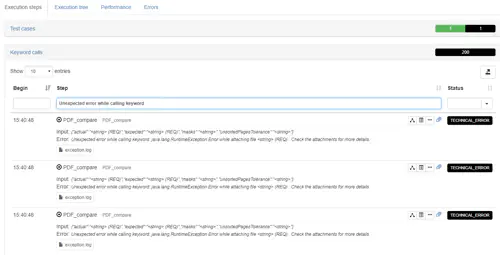
This table display the test plan execution steps in details, by default in reverse chronological order (last executed step first).
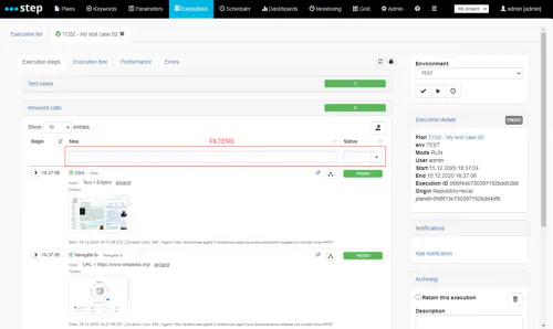
Again, you can use the table headers to filter the execution steps table and as well change the chronological display order :
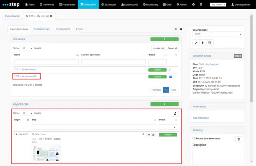
If you are using TestSet and TestCase object like the above example, you can see that the execution steps are grouped by test case : you can open a test case details by clicking on it :
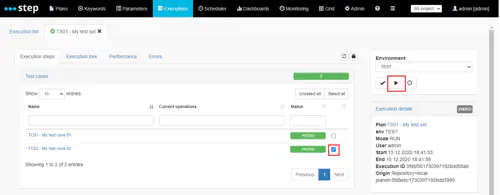
In addition, you can re-execute only selected test cases instead of the whole test plan by ticking its checkbox and click on the execute button :
You can toggle the display of the step execution details as follow. For Keywords it will show you for instance the input and output from the keyword call as well as the details of the keyword measurements:
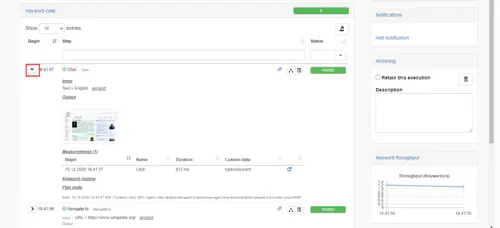
(1) Clicking on the right icon next to a measurement will bring you to the performance interactive analysis for this measurement.
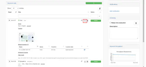
Finally, you can open directly an execution step in the Execution tree (see below) by clicking on its associated button :
Execution tree
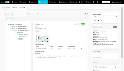
The table display your test plan execution steps as a tree in chronological order. Any node can be expanded to display its content :
Performance (beta)
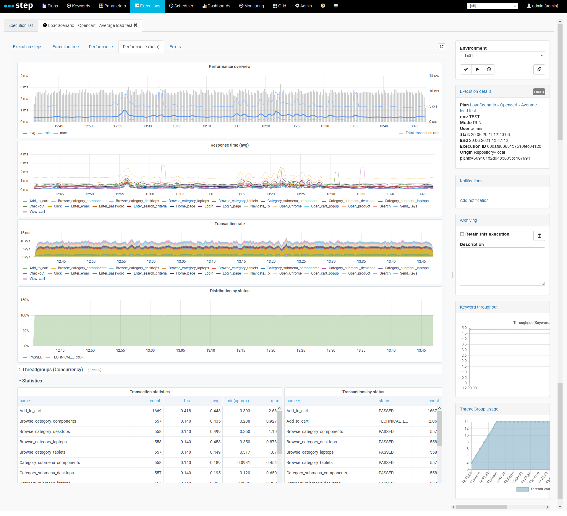
A new performance dashboard has been introduced with step 3.17 in a beta version. It is based on an integration with grafana and is currently using a prometheus server as its data source.
The integration requires some configuration described in the related plugin page
Performance
The performance tab of the execution view will provide you with the most frequently required metrics (keyword throughput, average response time, etc) out-of-the-box. These metrics provide both statistic over time as well as in a summary form, covering the entire execution. Furthermore, the different charts and tables can be refreshed in real time or browsed as in a stationary version of the view. Lastly, for more advanced queries, drill-downs based on custom dimensions or raw measurement browsing, an interactive session can be opened as well as persisted.
Real-time monitoring
When you first start a new execution, you will be taken to a monitoring view covering the last 30 seconds of the test and refreshed every 5 seconds, as illustrated on the screenshot below.
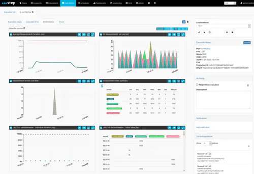
You are presented, from top to bottom and left to right with the following information:
- a line chart representing the average response time of the measurements (avg), aggregated over 30 intervals covering the selected time period
- a stacked area chart representing the number of measurements per second (tps), aggregated over 30 intervals covering the selected time period
- a stacked area chart representing the number of errors (either FAILED or TECHNICAL_ERROR), aggregated over 30 intervals covering the selected time period
- a summary table of all metrics applicable to the measurements (including percentiles, median, counts, etc), aggregated over a single interval covering the entire time period
- a scattered chart of the raw values of the last 100 measurements found in the selected period
- a table listing the last 100 measurement values found in the selected period
You can change the refresh rate and selected timeframe by clicking the top-level refresh button, and switching to the desired refresh rate (5, 10, 30, 60, 300 seconds or “OFF” for no automatic refresh):
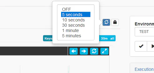
You can also change the timeframe toggle (covering either the last 5 seconds, 30 seconds, 5 minutes, 30 minutes or all-time data originating from the execution). Another important toggle is the Keywords vs Custom toggle, which allows you, in the event that you’ve used the (measurement api) to record custom measurements, to switch between keywords and custom measurements.

Execution summary
When an execution completes, is aborted or when the refresh rate is set to “OFF”, an additional tool for time-based selection and visualization is added to the top of the performance tab: the timeline widget.
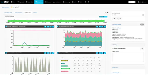
The rest of the view remains very similar to the real-time version, the only other notable change being that the two “last 100 measurement” dashlets are not displayed, because we believe they are much less relevant at the end of an execution.
Custom time range selection
The timeline widget displayed at the top of the view represents an aggregation over time of the the different keyword status found during the execution (usually PASSED, FAILED and TECHNICAL_ERROR). Implicitely the stack of all threw values is also an indication of the throughput of the execution in keywords per second.

By dragging and dropping alongside the timeline, the rest of the charts and tables will automatically update to the newly selected time frame:
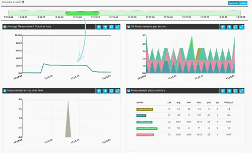
You can then decide to slide your selection across in order to browse through the test:

Or reset the selection to the original “all-time” state by clicking the white area of the brush:

Interactive session
While we believe the real-time and summary views along with time-based selection will cover most analysis needs, users also have the option to further investigate and mine their data by starting an interactive session. From this view, you will also be able to export raw measurements to a file in case you’d like to use a 3rd party tool to process the data.
The “Interactive session” button in the top left corner of the view will take you to the following view which an instance of the “RTM dashboard” (originally for Response Time Manager).
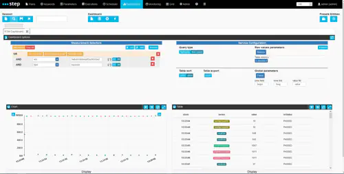
The response time manager offers data selection, aggregation and visualization capabality, allowing users to filter and drill down into custom measurements in order to diagnose complex issues.
Measurement Selectors
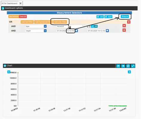
By default, two text filters will automatically be set in the default Measurement selector in order to only display data relating to the execution you had opened prior to clicking the interactive session button (eId=a_certain_execution_id) and focusing by keywords by default (type=keyword). However, various other attributes such as rnStatus (providing information on the keyword’s execution status) can be used to filter data.
For instance, by removing the eId filter and instead adding a date filter using the begin attribute (which points to the timestamp of each measurement), users can perform cross-execution queries and visualize data over multiple executions. In this example, we will query the raw measurement values of all executions over the last hour:
Standard Selectors
While the list of selectors depends on the custom measurements that you choose to create, below is a list of standard selectors and some of the possible values:
- begin: start time of the measurement
- eId: execution id of your test execution
- planId: id of the executed plan
- taskId: id of the related scheduled tasks if any
- project: id of the related project if any
- name: name of the measurements (either the keyword name or the custom name given while creating the measurement)
- origin: name of the parent keyword measurement for custom measurements (same as name for keyword’s measurement)
- type: type of the measurements (by default ‘keyword’ for automatic keywords measurements and custom for all others)
- rnStatus: status of the transactions (PASSED, FAILED, TECHNICAL_ERROR…)
- value: the value of the measurements (long number)
Service Configuration
Different types of queries can be sent to different types of services in order to browse measurement data. Currently and by default, two main services are made available:
- Raw values: this service allows users to browse individual measurements, which is great for investigating fine grained anomalies or just making sure that custom measurements are working as intended
- Aggregates: this service performs overtime or summary-style aggregations based on dynamic criteria such as the name of a measurement, its status or any additional metadata attribute that was provided through the measurement API.
These services can be toggled by using the following button:
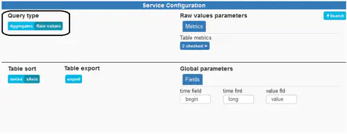
In either scenario, you can fire a new query (and subsequent aggregation) by clicking the Search button on either side of the dashboard:

The top part of the configuration dashlet contains service-specific configuration whereas the lower part contains configuration which is global to all services.
Raw values
As mentionned above, by default the raw measurement values are displayed upon loading the dashboard. These values are however paged and presented in groups of 100 values. In order to browse the values, you can use the small arrows available on both sides of the Chart:
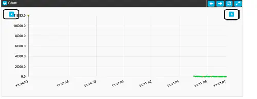
The table will update automatically.
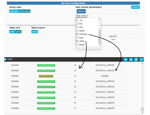
Another important point to note is that the scattered value chart will always display the value of the measurement, while the table can also display metadata attribute values. These can be selected using the Table metrics dropdown selector:
Aggregates
In order to perform over-time or summary aggregation, two key inputs must be kept in mind and are exposed under the tab “Grouping” of the Service configuration pane:
- interval size: tells RTM how large the aggregation intervals need to be and indirectly, how many datapoints will be returned and displayed. Defaults to “auto” which will automatically compute an aggregation with a target of 30 datapoints. However, arbitrary intervals can be provided in milliseconds, and the value “max” will compute an aggregation with a target of a single datapoint (also called summary mode).
- split attribute: tells RTM how to split series (or group measurements for aggregation). By default, a distinct series is created for each keyword name, however, any attribute can be used for grouping & splitting (such as rnStatus for error analysis or an empty or non-existing attribute for merging all keywords into a single series). Mutliple attributes can even be combined with a “;” for drill-down oriented queries. For instance: entering name;rnStatus will lead the computation of a distinct series for each keyword name and status combination.
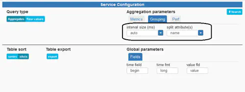
Additional advanced parameters are made available under the Perf tab. These allow for the partitioning and parallel computation of complex queries. The default values should only be increased if sufficient hardware is available on the backend (please contact our support for more specific information).
Much like in Raw values mode, various metrics can be selected for display in the table below. These, however are not related to metadata attributes, but are numeric results of computations based on the measurement’s values (for instance, mean/average, counts, sums, percentiles, etc).
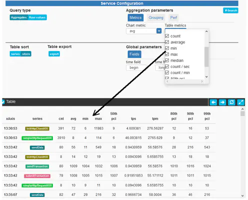
Note: the actual computation of metrics is not yet configurable as of step 3.13 but the underlying framework allows for extending metrics and we plan on exposing metric computation to our users in the future. New metrics such as standard deviation or concurrent transaction count, and new services such as a service allowing the visualization of the entire response time distribution or all percentile,s are also on our roadmap.
Global parameters
- Table sort: allows to organize datapoints based on time series or grouping series (keywords) first
- Table export: performs a CSV export of the table content and downloads the file (see Exporting measurements for raw measurements export)
- Global parameters > Fields: the name of the key fields used for aggregation and browsing, should not need to be modified as part of step’s use cases
Visualizations
In the RTM dashboard, the idea is to keep both a chart and a table visualization in sync at all times, regardless of whether the user is browsing raw values or aggregating data.

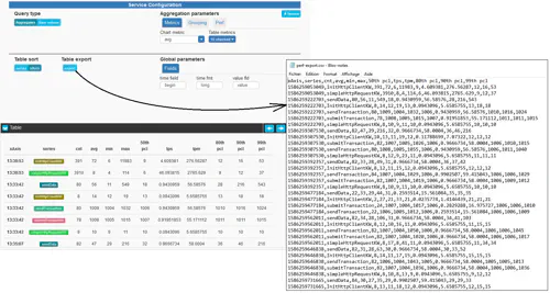
Lastly, a CSV export of the table can be ordered by clicking the export button of the service configuration pane.
Exporting measurements
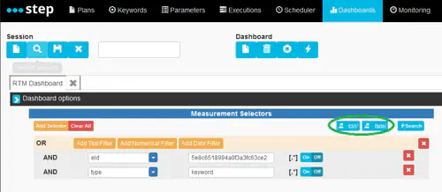
In case you’d like to use your own toolset to process the raw data, you can use the export functionality. The exported data still depends on the provided selectors.
Error
The error view display an overview of the errors (grouped by error type) which occurred during the execution :

You can jump directly to the nodes producing the error by click on the error type :

