Analytics
The analytics performance dashboard is the central place to analyze your performance metrics which are not related to a single execution. This view is also used with pre-populated filters when accessing it from a given scheduled executions i.e for synthetic monitoring.
Dashboard structure
The dashboard page comprises various components that work together to provide a comprehensive view of the execution’s performance. Below, you will find a detailed description of each component, highlighting its purpose and functionality:

- Time Range selector, allowing for relative or absolute time selection.
- Auto-refresh toggle. It can be turned off or set to a different time interval.
- Filters bar - Filters involved in the charts view.
- Add more filters button
- Basic/OQL switch mode
- Grouping settings
- Export RAW measurements as CSV file. Active filters and time range are considered while exporting.
- Summary chart - displaying history line and acts also like a range picker.
- The overview graph containing response times and throughput aggregated overall measurements
- The overview graph aggregated throughput by statuses
- Response times chart by measurements showing by default the average
- Response times chart settings.
- Throughput chart by measurements, the total throughput is displayed as bar chart and using the right axis
- Throughput chart settings.
- Response Time Chart legend
- Throughput Chart legend

- The summary table of all metrics applicable to the measurements (including percentiles, median, counts, etc), aggregated over the selected time interval. You can also use the table to show or hide specific series
- Table paginator
- Thread Groups chart - displays the number of active threads.
- Thread Groups chart legend
- Average (Avg)
- Minimum (Min)
- Maximum (Max)
- 90th Percentile (Percentile 90)
- 99th Percentile (Percentile 99)
- Throughput per Hour (TPH)
- Throughput per Minute (TPM)
- Throughput per Second (TPS)
Filters
Filters are essential for refining and customizing the data displayed on the dashboard. They allow you to narrow down your view and focus on specific subsets of information based on various criteria. Below, you will find a comprehensive list of actions and filters that you can use to tailor your data view according to your needs.
Text filters offer the flexibility to specify multiple values for searching. This means you can provide a list of values to search for, narrowing down the results to match any of the specified values.
In addition to text filters, you can also utilize numeric and date filters. These filters provide input fields that allow you to select numbers or dates, respectively, based on the filter type you choose.
To simplify the filtering process, common fields are available, providing predefined options that you can select from instead of manually entering values. This saves time and ensures accuracy when filtering based on known values.
For advanced users, an OQL mode is available. By switching to this mode, your filters are converted into an Object Query Language (OQL) query, allowing you to directly modify the query and perform more advanced filtering operations. Please note that OQL mode is recommended for users familiar with OQL and advanced filtering techniques. It’s important to be aware that using complex queries or involving custom attributes processing, can have an impact on dashboard performance. Performing extensive calculations or manipulating large datasets may result in slower response times. Therefore, it is advised to exercise caution and evaluate the potential trade-off between query complexity and dashboard performance.
Feel free to explore the available actions and filters, and leverage their power to customize your data view and gain valuable insights.
Time Range Selection
The time range selection feature allows you to focus on a specific section of time when working with the charts. It provides various options for filtering the range, enabling you to precisely analyze the desired timeframe. There are three ways to filter the time range: using the top time-range selector (1), manually dragging the range on the summary chart (2), or directly zooming on any chart (3).
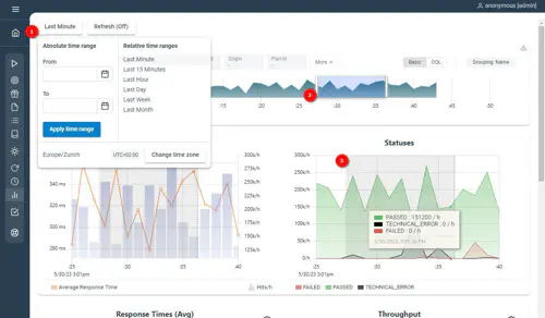
By utilizing the time-range selector, you can choose either a relative range or an absolute interval. When selecting a relative range, you have options such as “Last 5 minutes,” “Last hour,” or “Last day.” This allows you to conveniently focus on recent data without specifying exact dates. Additionally, if the auto-refresh feature is enabled, the time range will automatically move to the most recent time as new data arrives.
Alternatively, you can specify an absolute interval by providing two exact dates. This is useful when you want to analyze data within a specific time period, such as “From May 1, 2023, 12:00 PM” to “May 5, 2023, 6:00 PM.”
Moreover, the manual dragging feature enables you to adjust the time range directly on the summary chart. By dragging the handles, you can narrow down or expand the timeframe based on your analysis needs.
Additionally, if you need to focus on a particular area of interest within a chart, you can zoom in directly on that specific chart. This allows for a closer examination of data points and trends at a more granular level.
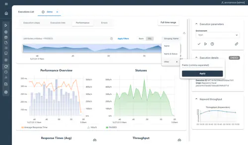
Grouping
The chart grouping feature allows you to organize and categorize the data displayed in the charts based on different criteria. By grouping the charts, you can gain insights into specific subsets of data and identify patterns or trends more effectively. By default, the charts are grouped by Name, providing an overview of data based on the unique names associated with each entry. Another predefined option is Name & Status, which provides additional categorization based on the status of the entries.
In addition to these predefined options, you have the flexibility to specify one or multiple custom fields for grouping. These custom fields can be defined based on your specific requirements, allowing you to categorize the data in a way that aligns with your analysis needs. For example, you can specify custom grouping fields such as Name and Task ID, separating multiple fields by value. This enables you to drill down into specific combinations of data and gain deeper insights into the relationships between different attributes.
Mention: Only the Response Times, Throughput chart and Table view will be updated when using grouping.
The chart grouping capability empowers you to customize the organization of the data in the charts, making it easier to identify patterns and trends within different subsets of data. By exploring different grouping options, you can unlock valuable insights and make more informed decisions based on the specific criteria that matter to you.
Measurements Settings
The Response Times and Throughput charts offer a few visual settings that allow you to customize the display and gain deeper insights into the performance metrics. These settings provide flexibility and control over the metrics and measurements shown in the charts.
For the Response Times chart, you can choose to display the following metrics:
By selecting the desired metrics, you can focus on specific aspects of response times and analyze the performance of your system accordingly.
Similarly, for the Throughput chart, you have the option to display the chart based on different throughput metrics:
These metrics allow you to assess the volume and rate of data being processed by your system over time.
In addition to metric selection, both charts provide a measurements dropdown. This dropdown allows you to hide or unhide specific measurements in the charts. By selectively showing or hiding measurements, you can focus on the relevant data points and declutter the visualization. Furthermore, the measurements dropdown is synchronized between the charts and the table view, ensuring consistent visibility settings across different representations of the data.
Whether you prefer visualizing the data in the charts or exploring it in tabular form, the ability to control the displayed metrics and measurements provides flexibility and allows you to tailor the view according to your analysis requirements.